
Sunday, December 26, 2010
Merry Christmas
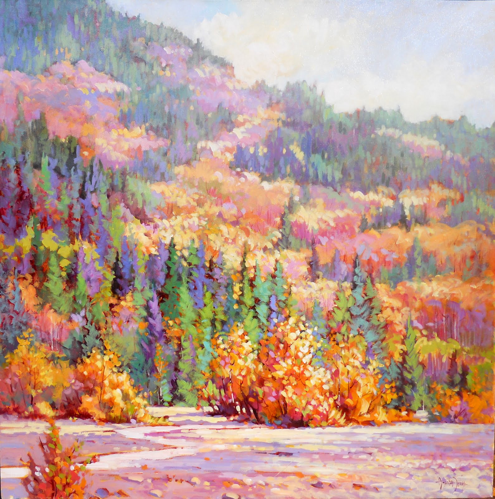
Fraser Riverbank, 16x20, acrylic

I hope that everyone had a good Christmas. We enjoyed a wonderful family day, but I am enjoying the quiet of today and I finally picked up a brush for the first time in two weeks. It feels good to get back to my easel, I am working on a commission and hope to have it finished by the end of the week. This piece is from a walk along the Fort to Fort trail in Fort Langley, a beautiful spot on the Fraser River near Vancouver.
Wednesday, December 15, 2010
Older pieces

Tuesday, December 7, 2010
Another Trail
Forest Greens, 15x30, acrylic

As I have mentioned before I enjoy painting these long horizontals. I wanted to try a subject that has a strong vertical pull ie: the tree trunks. I think it creates a bit of a tension. The hits of warmth help to off set all of the greens, and the trail pulls you in. I seem to have had a lot of interruptions lately and I haven't done as much painting as I would like, therefore not enough posts. I hope to get in the swing at least by the new year.

Tuesday, November 30, 2010
Mountains
Mountain Vista, 24x36, acrylic

I remember when we first moved to Calgary, Alberta in 1968 from a seaside town in England. We took a drive into the Rockies and were just mesmerized by the mountains, they were breathtaking. Forty two years later I still feel that way. This piece was inspired by a trip to Whistler. I stylized the shapes and colours and tried to capture some of their majesty.

Monday, November 22, 2010
Verticals
Shoreline Magic, 24x12, acrylic

Some subects just call for a certain format. This one I felt needed to be a vertical. I enjoy the long narrow shape, whether horizontal or vertical, it seems to make for an interesting composition. In this one I wanted to put the highlight on the bubbling surf at the shore. At first I thought that I would make the background island more indistinct but I couldn't seem to help myself and added more detail. Overall I am pleased. It seemed to capture the feel that I was after.

Friday, November 19, 2010
Rework
Island View, Hornby, 30x40, acrylic

I brought this piece home from a gallery and decided to rework it. I love that I can do that, acrylics are so versatile. I completely redid the sky and made a few changes to the foreground. Usually if I am not pleased with an older piece I am tempted to just repaint the whole thing, so I consciously try to take my time and really think it through. Maybe I won't need to change as much as I thought. I can look at an area and think it needs to be darker, but maybe the area next to it just needs to be lighter. It is all relative. The real frustration is when you know it needs something but you just don't know what.

Monday, November 15, 2010
A Favourite Place
Beach at Savary Island, 18x24, acrylic

This is an older piece, but it is one of my favourites. I like the atmosperic misty feel in the background. Savary Island is near Powell River on the Sunshine Coast, it is a beautiful spot and this one takes me back there.

Monday, November 8, 2010
Another Trail
Forest Trail, Tofino, 30x30

Well I just can't resist these trails. They are so full of character and atmosphere. The trees are so old and the branches hang down and reach out creating wonderful patterns. I always find the values to be a real challenge in this type of scene. I tend to try and simplify it by making the foreground dark and the background light. It is easy to get carried away with lots of little highlights dancing all over the place but that can fragment the whole image and take away the strength of it. I also painted this with quite a limited palette. Ultra blue, cad yell light, aliz crimson, brt sienna, yellow ochre, thalo green and titanium white.

Wednesday, November 3, 2010
Skies
Sunset Glow, Tofino, 16x20, acrylic

I have lately been very attracted to painting different skies. I have done some larger pieces that were almost exclusively sky and I enjoy being able to interpret the wonderful colours and shapes on the canvas. Skies can offer such a wide range of possibilities in a painting, everyone a little bit different. The colours can range from the most beautiful silvery greys to vibrant oranges and reds, great stuff for a painter. The sky being the source of light in a landscape will always set the tone of the piece. This sunset set the stage for this one, I wanted the sky to be the main character, but I also wanted the crashing waves to play a supportive part so I kept them a little more subdued.
Friday, October 29, 2010
Patterns
Whistler Ridge, 30x30, acrylic

I was attracted to this subject because of the patterns of snow on the ridge. The light and dark patterns were also a great opportunity to play with. The trees were a very dark band across the middle ground, so I opened it up a bit to create a path of light from foreground to background. Greens of course are always a challenge, I tried to add warm and cool greens to add interest. I am overall quite pleased but I may still tinker a little bit.

Friday, October 22, 2010
Something Different
Riverside, 11x14, acrylic

This one is a little bit different for me. I painted it a while ago and it has become one of my favorites. I think that I like the somewhat graphic design of the trees against the silvery sky and water. We live close to a river and dykes, this came from walking along the trails by the river.
Wednesday, October 20, 2010
On the Road
Road Trip, 36x48, acrylic

I have often found that some of the best subject matter is seen as we fly by in the car. We were on our way to Sunpeaks near Kamloops last thanksgiving. Fall was in the air and the colours were turning the hillsides many beautiful shades. As I have said before I like to pull the viewer into a scene using trails etc, so I thought maybe a road would work. It is the first time I have done this, maybe more will follow. It is a large piece and I kept the palette quite subdued, mostly blues and orange with some cad red and yellow. I first had too much colour at the sides, I greyed that down to pull the attention into the painting. I took this one to the Rendezvous Gallery in Vancouver. Unfortunately this image has washed out the blues in background, but at least it gives you the idea.

Thursday, October 14, 2010
Complementary Colours
Amphitrite Point Lighthouse, 22x28, acrylics

This is a painting of a lighthouse in Ucluelet on the west coast of Vancouver Island. The terrain is very rugged and the ocean is wild. I used a complementary palette of colour on the rocks, yellow gold and purples to make it sing as much as I could. I also like to use warm and cool of the same colours when I can, for example the blues in the sky and water. I keep hoping that I will be able to mindlessly create good work, but I realize more and more that I have to have my thinking cap on at all times. This piece is available at the Rendezvous Gallery, Vancouver.

Tuesday, October 5, 2010
Square Canvas
Shoreline Blues, 30x30, acrylic

Lately I have really been enjoying painting on a square canvas. It seems like an odd format for a landscape painter, but I find it very appealing. I also like the finished look of a square painting when it is framed. Maybe it is the challenge of breaking up the symmetry of the four equal sides. This is a very simple composition, similar to others I have done. I stylized the shapes in the sky and sand to add interest and played with a variety of blues and greys.

Sunday, October 3, 2010
Show Night

We had a great time at the opening last night. This is a picture of me with my husband and daughter. It was a very good turnout and lots of interesting people to chat with, and people were really interested in the art, which is always so nice. I met some new fellow artists and I felt very proud to have my work hanging with theirs. Thanks to Anne and George for all of their hardwork in putting on the show.

Wednesday, September 29, 2010
Don't Give Up
Sea Shore Sparkle, 12x16, acrylic

This painting is an example of not giving up. I started out with the idea of doing something high key, that is no real darks. I also had trees and beach and water etc. Well I didn't care for that so I then added a full value range but that wasn't working either. I kept feeling that I just couldn't settle. At this point I thought about just putting it aside but I didn't want to give up on it. I decided to open up the composition and have a more open sweeping feeling to the water and horizon. I pushed the blues which I love to do and now I am pleased. Making changes and building up the paint can even add another dimension.

Sunday, September 26, 2010
For the Show
Wind and Sea, 18x24, acrylic

This piece will also be in my upcoming group show. The opening will be on Sat Oct 2 at the Jenkins Showler Gallery, 7pm - 10pm. I wanted to capture the feeling of the wind at the seashore so I stylized the shapes and tried to create some movement in the sky. I find more and more I want to be expressive and paint less of just a rendering of the subject.

Thursday, September 23, 2010
More Trees
Falling Leaves, 12x16, acrylic

Fall is in the air and of course I am attracted to the wonderful colours of the turning leaves. This one came from a photo I took last year. I put in the bright colours of the main tree on a white canvas and then the challenge was to create a background that would stay back and not compete. I wanted the whole piece to have some jazzy strokes of colour, overall I am pleased. I constantly feel that I could push things further, more paint, more colour, more interesting shapes. I feel energized and motivated because there is so much left to explore.

Saturday, September 18, 2010
Another for the Show
Against the Wind, 22x28, acrylic

This is another piece for the show at Jenkins Showler gallery. I like to add character to the trees and elements in the painting. So I push the shapes and colours, I think it makes for a more dramatic piece. I have heard from the Birthplace of BC Gallery that the CBC was there in Fort Langley with a news team to interview artist Al Colton for a news story. His show will be opening next week at the gallery. The item will be on the Monday evening news. He has trained and worked with some of the group of seven and does wonderful Canadiana type of work.

Monday, September 13, 2010
Show coming up
Blue Beyond, 36x36, acrylic

I will be part of a group show at the Jenkins Showler gallery. It is their 20th anniversary, so certainly worthy of a celebration. The opening is on Oct 2 and I hope that some of you can make it. This is one of my new pieces. I always love seeing the ocean through the trees as you get closer to the end of the trail. I was going to really push the colour but I wanted a tranquil feeling so I kept it fairly soft. I also decided not to make the foliage on the trees too heavy and dark. I am overall pleased with the result.

Thursday, September 9, 2010
More Colour

Monday, September 6, 2010
Trails
Rainforest Trail, Tofino, 30x30, acrylic

I just love to paint a trail. It is such a natural way to lead the viewer into the painting. I want them to wonder what is around that corner beyond the trees. I want them to smell the forest and the ocean beyond. There are some wonderful trails around Tofino and the Pacific rim on Vancouver Island. The vegetation is very lush with salal and ferns. The forest is quite shady but as you get closer to the beach the light starts to dance around, and you can hear the waves crashing. I used some brush strokes that almost scrubbed the paint on for some of the foliage, it worked quite well. This much green is always a challenge. This image seems to have a lot of light reflecting off the canvas, sorry about that.

Monday, August 30, 2010
Patterns and Shapes
Quiet Shores, 12"x24", acrylic

I like to paint this type of format especially as a horizontal. I find it especially suits a landscape. It works well if you want to capture the feel of a sweeping vista. This is another scene from the Tofino area on the west coast of Vancouver Island. I enjoy using a stylized approach, it allows me to have fun with patterns in the sky and rocks etc, and be more expressive with the colours. More and more I seem to be pushing the patterns and rhythms of shapes.

Tuesday, August 24, 2010
Trip to Port Renfrew
China Beach, 36x36, acrylic

We had a great couple of days in the Port Renfrew area of Vancouver Island. Although I did slip on the rocks and fell and broke my camera, I was too excited with the scenery to watch my step. This painting is from an area called China Beach, it is a bit of a hike down but it is well worth it. It is wild and fabulous like so many of the beaches on the west side of the Island. This day the light was just bouncing around on the waves and the misty fog was wafting in. The biggest challenge was the water. I may still play around with it.

Monday, August 16, 2010
Back from Holiday
Misty Shores, 22x28, acrylic

I just got back from a trip to Vancouver Island. We explored around the Port Renfrew area. There are some wonderful rugged beaches and trails to check out. I got some good subject matter and I look forward to posting some new images. We have been having a heat wave here, and it is very hot in my studio. I find I tend to wilt in the heat and I am not very productive. I hope to get it in gear later in the week. This is a painting that I did a few years ago. It is very much like the area that we were just in. I have always liked this piece. I think it is important to try and capture the atmosphere of a place, I did a number of glazes on this and it helped to give it that misty quality.

Thursday, August 5, 2010
Painting in the Garden
Leafy Canopy, 24x36, acrylic

Well I am finally getting around to a new post. I was busy over the weekend. The Birthplace of BC gallery has an annual anniversary celebration. Many of the artists paint outside in the gardens around the gallery. It is a fun event and always draws a good crowd. I worked on this one and overall I was quite pleased with it. I brought it home to add the finishing touches. The inspiration for this came from a trip to my brothers in Sooke on Vancouver Island. We explored some nice little beaches along the way.

Monday, July 26, 2010
Making Changes
Gulls at the Shore, 24x48, acrylic

Well this is the third time that I have posted this image. Each time I have made some changes, it drove me crazy. I am now happy with it and I think I have created a better focal point by adding the gulls at the water's edge. The palette is somewhat subdued and I think it adds a little bit more interest and life to the painting. I like the soft reflective shoreline against the harder edges of the rocks.

Wednesday, July 21, 2010
Different Palette
Autumn Splendour, 36"x36", acrylic

I find that I get very comfortable with my usual colour palette. I can readily reach for safe mixes that will do the job. With this one I wanted to try something different. It was great fun to play with the beautiful warm colours. I ended up glazing over the upper part of the hillside with white to create more atmosperic perspective and to cool it down. I think that sometimes I get caught up in the result and I don't take time to enjoy just putting the paint on the canvas, and playing a little. I just took this piece out to the Birthplace of BC gallery in Fort Langley. I will be out there on Aug 1 and 2 (Sun and Mon) painting in the gardens with other gallery artists.
Thursday, July 15, 2010
Playing with the light

The whole reason for painting this image was to try and capture the light bouncing like diamonds on the water. I first used a warm yellow orange colour and built up to the light. I was trying to get a bit of a glow. I also used my finger to smudge some edges to get a reflective quality in the water. I kept the blues quite strong to help with the feeling of a bright day. We like to rent a boat and explore the islands around Howe Sound it gives a very different perspective being on the water.
Wednesday, July 7, 2010
Light and Shade
Dappled Light, 30x36, acrylic


I really do enjoy painting trees. In this one the light was very strong in contrast to the shadows. I wanted an overall warm feeling, so I didn't make the shadows too cool. Overall I am quite pleased with the effect.
Sunday, June 27, 2010
Another Big Sky
Golden Sky, 36x36, acrylic

I am enjoying these sweeping sky paintings. The colours are also wonderful to play with in big broad strokes. The main challenge is to establish a feeling of perspective. Keeping the edges soft is also a challenge in acrylics.

Sunday, June 13, 2010
Painting Big
Power and Glory, 36x48", acrylic

I really enjoy painting a large canvas. I find it very freeing to use big and bold brush strokes. I seem to be more expressive on a larger scale. Last year we travelled to Powell River, B.C. and saw some beautiful sunsets. That was the inspiration for this piece. On my first attempt I had the water much too busy, it seemed to compete with the sky. I calmed it down and I am happier with the peaceful feel of the painting. I always like to try and draw the viewer in, so it was important to have a sense of perspective in the sky and the water. I think I will do some more of these.

Wednesday, June 9, 2010
After the Show
Mountain Valley, 30x40", acrylic

Well the fundraiser was a bit of a dissapointment. No sales to report. It is a lot of work for just a two and a half hour event. The good thing is I now have some new paintings. This is one of them. What first drew me to this image was the lovely blues in the mountains and middle distance. It gave me a chance to play the warm foreground colours off against those blues. The challenge was the bare trees in the foreground. I wanted to keep them loose and not paint every bare branch. I am trying to make more creative brushstrokes, dragging and pulling and using the brush on the side. I think trial and error is the best way to learn. I almost always use flats.

Friday, June 4, 2010
Preparing for a Show
Lionsgate from Stanley Park, 24x30, acrylic

Finally I am getting around to a new post. I have been preparing for a show on Saturday evening. It is a fundraiser for our local hospital foundation. Last year it was a wonderful event. My preference is to paint larger canvases and now I am concerned about logistics, always something to worry about! Thank goodness my husband will be helping me set up. I find the frames are so easily damaged. Yesterday I took pictures of the paintings and today I will get them in frames and make up title cards etc. My problem seems to be that I want to keep fiddling with them, just one more stroke here or there. I prefer to live with a finished work for a while until I feel really good about it. This piece I wanted to really make use of the warm underpainting and let it come through, I am pleased with the overall warm feel of it.

Wednesday, May 26, 2010
Artistic License
Helliwell Park, Hornby, 22x28, acrylic

I painted this one last summer. Hornby Island is one of the gulf islands near Vancouver. The coastline of this park is very distinctive with windblown grasses and cliffs. I took some license in playing up the colours, and simplifying the shapes. Overall I was pleased and felt that it captured the feel of the place.

Wednesday, May 19, 2010
Making Changes
Pacific Shores, 24x48, acrylic
 Well it didn't take me long to realize I was not happy with the last painting I posted. When I saw it in print it was just not right. I thought it seemed quite blah! So here is what I have done with it. Maybe it will get changed again I am still not very excited with it. I think I need to take a break and look at it later with a fresh eye. I often have a vision and get quite excited about it and then that seems to wane somewhere in the execution of the piece. It is so important to keep an eye on the larger picture and value pattern and not get caught up in endless little details that will not help.

Challenging yourself

Tuesday, May 11, 2010
Painting with Feeling
Tofino Morning, 18x36, acrylic

I really think it is important to have a feel for what it is you are painting. To know your subject and have a sense of it. We have been visiting Tofino for about 30 years. It is on the west side of Vancouver Island and has a wonderful wild and natural feel to it. The beaches are vast and wild and the Pacific Ocean pounds against the rugged shoreline. It is a favorite subject matter of mine. As I am painting I feel myself there amongst the rocks and windblown trees at the shore. I have a sense of what it is that I am trying to convey. It is such a humbling thing to try to capture the power of nature in a painting. It is certainly a challenge for me!

Sunday, May 9, 2010
65 Red Roses
One Red Rose, 8x10, acrylic

I was asked to participate in a fundraiser for the Canadian Cystic Fibrosis organization. 65 artists from the Federation of Canadian Artists were asked to paint an 8x10 image of a single rose. These will all be combined into a large mural and presented to the Cystic Fibrosis group at a gala evening next Saturday. The mural will then be auctioned off as a fundraiser. I am very happy to be part of this great event. So this is my contribution.

Saturday, May 1, 2010
Leading the eye in
Country Lane, 30x36", acrylic

I really enjoy pulling the viewer into a composition. Lanes, trails, pathways are always very appealing, we want to naturally follow them along. I try to hold the viewer visually in the picture, but also emotionally. To have them wonder what is around that corner or at the end of that pathway. To feel themselves in the scene exploring. I have been trying to control edges more lately. I find working in acrylics that I tend to get very hard edged. This one I kept the background trees as soft as I could and I am quite pleased.

Friday, April 23, 2010
Spring is Here
Burst of Blossom, 30x36", acrylic

I have not had much time to paint this week. Spring is definitely here in Vancouver so I thought I would post this image from a few years ago. It has always been one of my favourite paintings. I wanted to capture the feel of the blossoms bursting out. I had fun pushing the pinks and yellows. Today I have time to paint and I am really looking forward to it. I have been thinking about making my landscapes a little more contemporary. Maybe bolder colours and patterns, maybe more surface texture. I like to try new things it keeps me on my toes.

Sunday, April 18, 2010
New Work

I live in an area that is basically surrounded by dykes. This is a little creek that runs close to a path that is a very popular dyke walk. I wanted to express the wild overgrown feel surrounding this subject. I also like to try and capture a sense of movement, maybe the wind is catching the grasses and leaves. The blue of the water seemed to be a nice complement to the oranges. Let me know what you think.
Wednesday, April 14, 2010
New Work
Feeling Blue, 30"x30", acrylic

I just took this one out to the http://www.birthplaceofbcgallery.com/ . The windblown trees and the shapes of rocks and waves are always an inspiration to me. I grew up by the seaside in England and I think my heart is close to the ocean. I love the smell and sounds of the waves and gulls. I like to say that I don't need to be in it or on it but I like to be by the water. I don't often put people in my work. I like to look at a painting and imagine that I have discovered it, a quiet place for me to explore.

Thursday, April 8, 2010
New Painting
Walk through the Rainforest, 36x36", acrylic

I wanted to paint something loose and strong. I started this one by just making some gestural marks with a paper towel dipped in paint. I felt that it gave the painting a more energetic start that I really enjoyed. I wanted to maintain that energy throughout. I tried not to refine everything too much. When I look at nature I like the overgrown rugged nature of it. We have walked these boardwalk trails through the rainforest around Tofino for many years. Lots of climbing stairs and then finally going down toward the beach. It is such a magical place.

Thursday, April 1, 2010
New Painting
View to Howe Sound, 24"x30", acrylic

This is another reworking of an older piece. I am much happier with this. It has a lot of paint on the canvas and I like the textural feel as the paint builds up. Making a clear value difference between the foreground, middle and background helps to create a sense of depth and pulls the viewer in. I wanted to capture the silvery light on the water, from one of the many viewpoints looking over Howe Sound.

Saturday, March 27, 2010
New Work
Shannon Falls, 36"x24", acrylic

I have been struggling along on this one for a few days and I am still not sure if I am happy with it. I have had a photo for awhile that I have wanted to paint, mainly because of the white shape of the falls. However the rest of the image is very dark. When my husband was at the falls during the Olympics he took another shot, this time the background was completely in mist and very light in value. I liked the contrast but neither image really gave me enough information. I am liking the direction of this better than my first attempt which had the rocks a darker value. The foreground was not clearly separated from the middle and background and I lost the depth that I feel it needs. This one seems to give it more atmospheric perspective. I will post an update if I work on it some more. It is hard sometimes to know when to stop fiddling. I really prefer a somewhat spontaneous painterly look. When I start reaching for smaller brushes and getting into too much detail I am usually in trouble. I will often say at a class if you are in trouble pick up a larger brush.

Monday, March 22, 2010
Glazing
Longbeach Surf, 30"x40", acrylic

I brought this painting home from a gallery and had another long look. I felt that it seemed a little blah, and I needed to warm it up. I decided to glaze the foreground with transparent red oxide and a little nickel azo gold. It seemed to bring some life back into the rocks. When an area is not working is does not always need a complete repainting. Glazes can add a degree of sophistication and sublety to the work. I find it works especially well if an area has become chalky because of too much white in the mix. You can brighten, tone down and grey areas, all with glazes. The horizon looks a little curved but that is my photography.

Wednesday, March 17, 2010
SFCA Designation

Tuesday, March 9, 2010
New Painting
Squamish Riverbed, 24"x36", acrylic

This was inspired by a day trip to Squamish last fall. The warm fall colours against the cooler neutrals in the mountains and surrounding dry riverbed were what I wanted to emphasize. I first painted the mountain in more detail, but it was a distraction. I try to think what is this painting about, is it the mountain, the foreground, the fall colours? It cannot be about everything. I try to simplify the supporting cast and play up the star character. In this case the trees. What do you think?

Subscribe to:
Posts (Atom)
LinkWithin
